Research
Understanding The Problem Objective
We approached this project as one set to achieve a goal. Internet banking and online payments platform have brought ease to individuals and small businesses that carry out financial transactions. we initially set out to find out what portholes users have encountered using these platforms, we did this by conducting a survey, and questions on usability and missing features or functions they would like to be added were asked. A Likert scale was used in the survey (Questionaire) to determine the usability level of the online banking platforms the participants used. 100% of the participants reported they were “
very easy” to use.
Participants were also asked
open-ended and
closed questions on what features they would love to experience when banking online. Survey questions were kept short to avoid overwhelming the participants.
View Survey QuestionsWe developed an objective from the survey results and these objectives met varied user pain points.
What is Project's main Objective?
To Create one web-accessible platform where users can access personal and business banking Solutions.
More details?
Create a web platform for mobile-first banking solutions.
Send and receive money to personal account
Access business banking solutions on the same platform
Access saving plans for both personal and business accounts
Manage travel plans and bookings
Send money internationally.
Add-ons
Speak with the designated account manager on concerns (In-app staff and customer messaging)The Users Internet banking is presumed to be used by any active adult, even children. Our core users are those who prefer or would love to opt for the convenience of banking with a bigger screen than that of mobile, due to the activities they would be carrying out.
Market Research
Who are the big players
Designing a new product that has not yet been introduced to the market has its perks, recognizing the big players would go a long way in understanding what quality of product you would design that can shake the market
I did a competitive audit on Monzo business & Nat west business, these are Weba's major competitors.
Those who'll appreciate Weba
Identifying Users
Weba is designed to be accessible to both mobile ad web users, the web application will be mobile responsive and available to use seamlessly on mobile devices.
The objective for the creation of a weba is to create a flexible internet banking solution that is accessible through the web, that primarily exists in mobile first banking solutions. Therefore our focal users are those who have accessibility to devices with larger screens such as Desktops, PCs, laptops and Pads, Basically screens with a bigger resolution than mobile phones.
Making sense of the chaos
Collating Qualitative Research Data
After defining the target audience, I was left with making sure I uderstood what their needs really were. I conducted informal interviews, asking questions relating to the our products objective to see if it was really going to make an impact or maybe it was just solving a problem that did not exist in the first place. I had to be sure and hearing from the horses mouth (the Users) was my nest bet.
After conducting interviews, I now had qualitative data from the initial survey conducted at the beginning of the project, research i had done on existing financial applications. collating this data to make sense of it was my next step.
How will Fidelis benefit from Weba?
Martha below, represents a group of users with similar pain points as described in Martha's persona above.
I utilized this agile method of representing and collaborating on user stories for this project. also organizing my. the blue task are the high level task and it distills to subtasks as it changes from red to green downwards.
I then proceeded to design the IA, this helped in simplifying the whole system and served as a guide to designing the various user stories, just like the ones indicated above. Its a simple platform with quite a number of features, I had to represent each feature in this flow, Features in a shade of pink boxes are features that are not included in the MVP (First release) but were included in the system flow diagram for scalability sake. Since the team employed the agile methodology, I reviewed this diagram as many times as possible to accomodate any update.
Putting Pen to Paper
Conceptualizing
I call this milestone conceptualizing, the is the first stage in turning all previous work done to something tangible. This stage was pretty mind tasking, as I had to decide which positions were suitable for the different elements in the application. For convenience sake, I used a paper and pen, if i made a mistake I could easily start on a new clean sheet. the top, left and right panes remained the same though out all the screens, only the 'middle' contents changed from screen to screen.
Right and left panes were designed to be collapsible, this was to ensure user had an option of viewing less elements to get a cleaner, less crowded view. I implemented the use of popups too, most features seemed easily accessible if explored through pop ups, though this will be tested during the usability testing to ensure its good to go.
I moved on to put together a design system to serve as a guide when designing the high fidelity prototype. incase of future updates on the design or new design team members, this design system will make it easier to assimilate changes.
The color system fully represented the brand colors, general sans variable font was used throughout the project, buttons were given a 10px curve on the edges to make them visually pleasing and so much more interesting details were considered when putting together the design system.
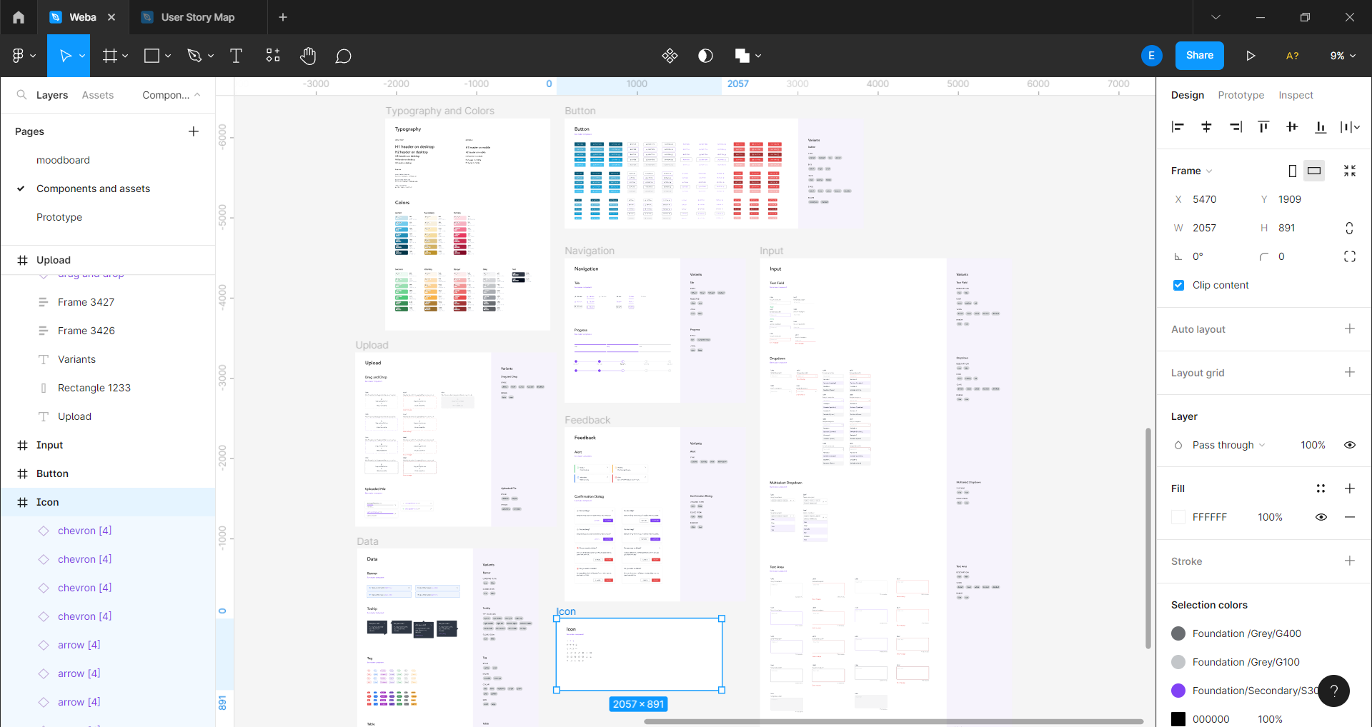
I created re-usable components that can be used throughtout the lifetime of this project. this made alterations very easy, make changes on one of the components in the component library and it is effected on all screens where component was use. this was a game changer as it helped me save a lot of time when making changes to effect feedback.
Every screen needed to create a seamless flow of interaction was designed, no matter how small the change was, this was done to ensure every element of the application was in tune. We do not want a loading button having a different color from the project's accent color. Leaving out bits and pieces for the developers to fill in may result to inconsistency in the design.
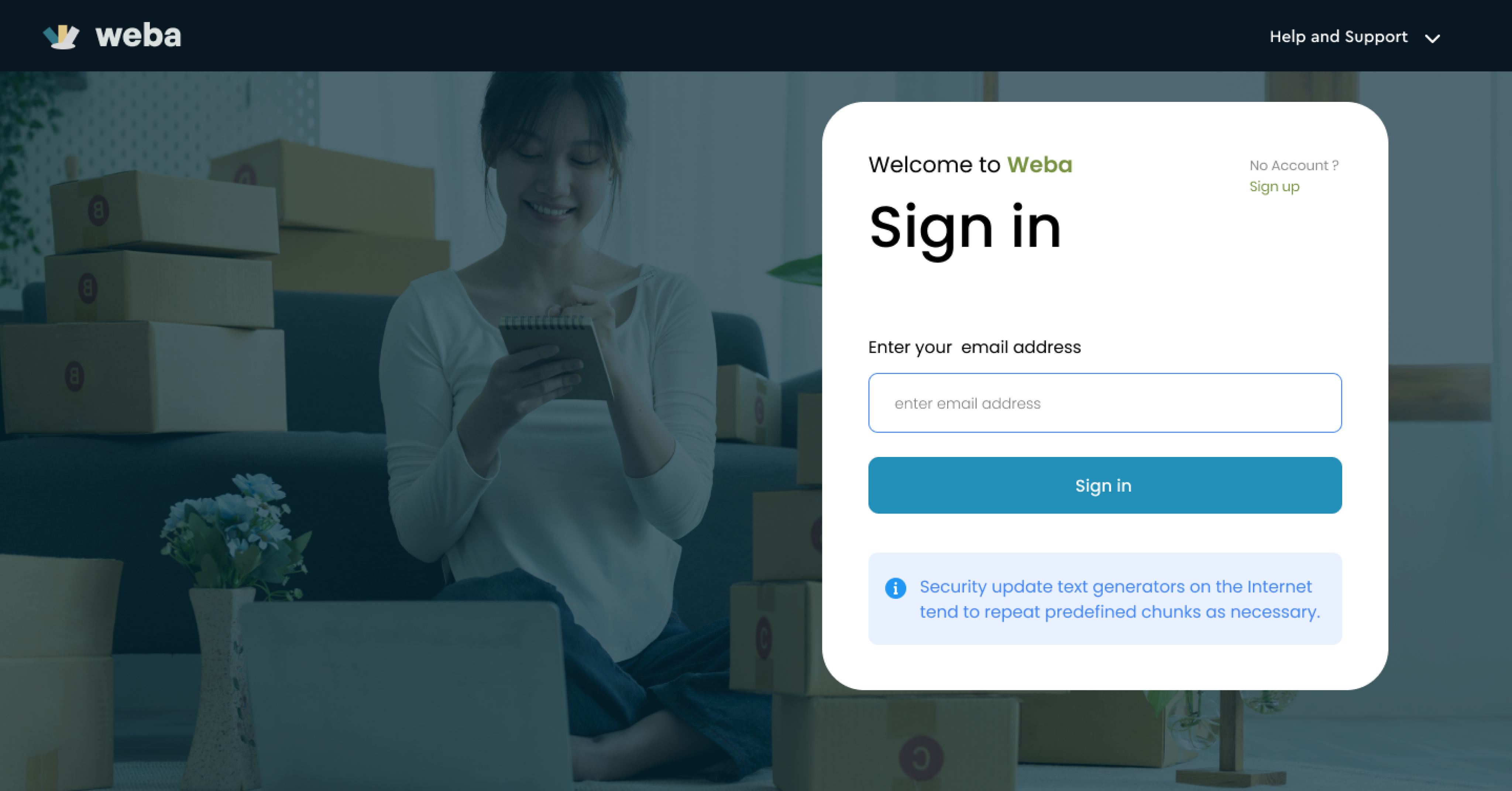
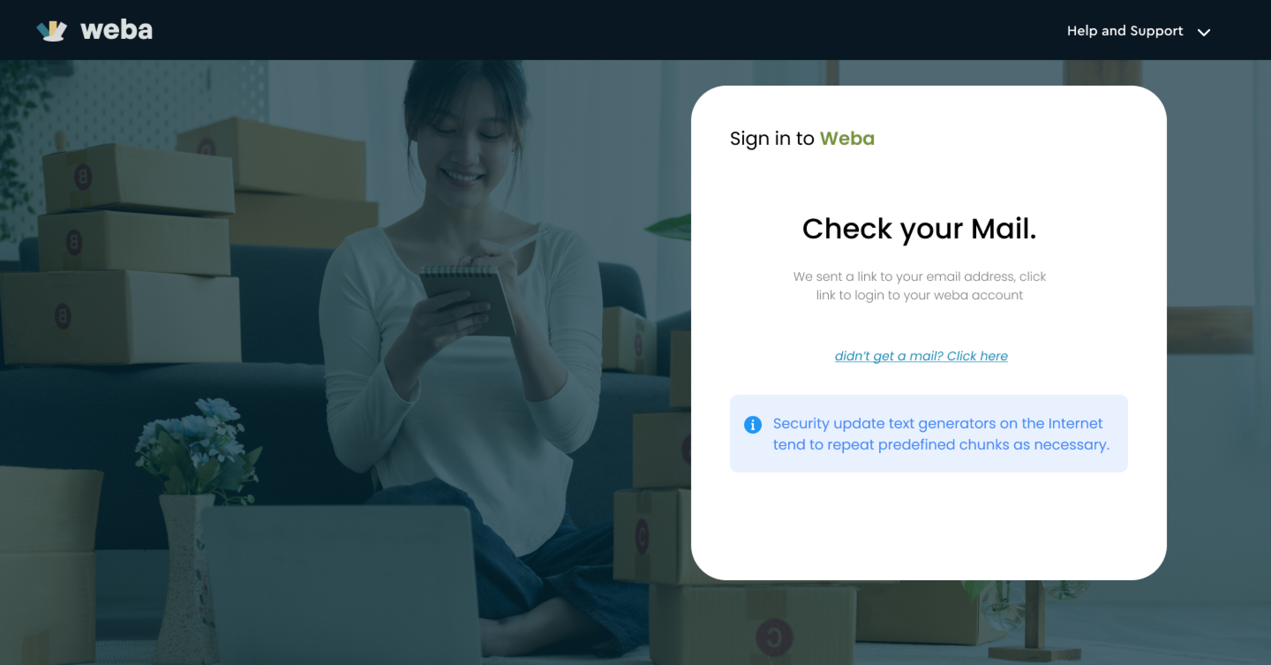
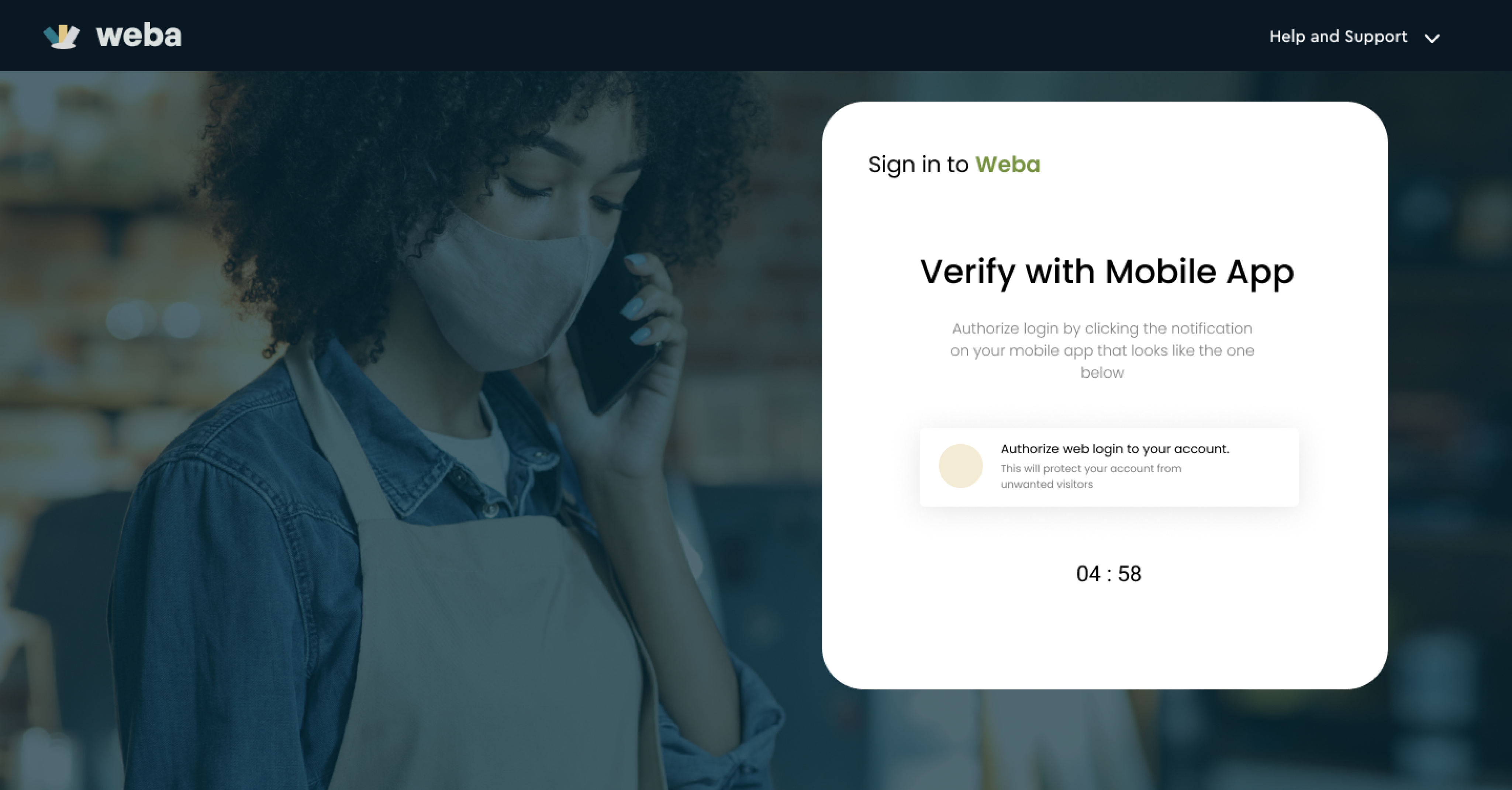
Since Weba business is available to its mobile users to subscribe, security was linked to their mobile apps. Users have to confirm login though email and their mobile apps. A code login system is to be introduced in later versions of Weba for web.
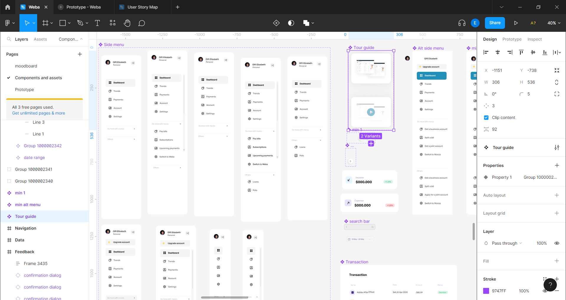
Exploring pop-ups
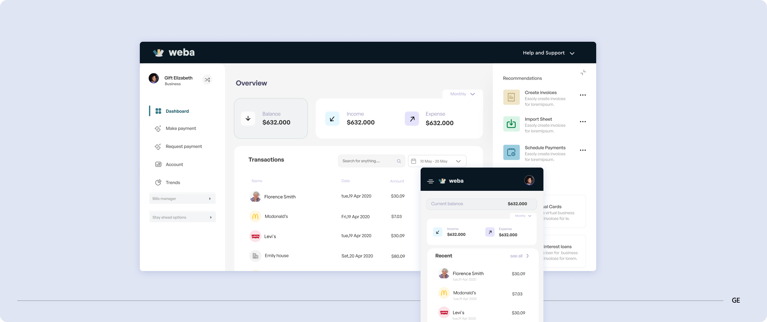
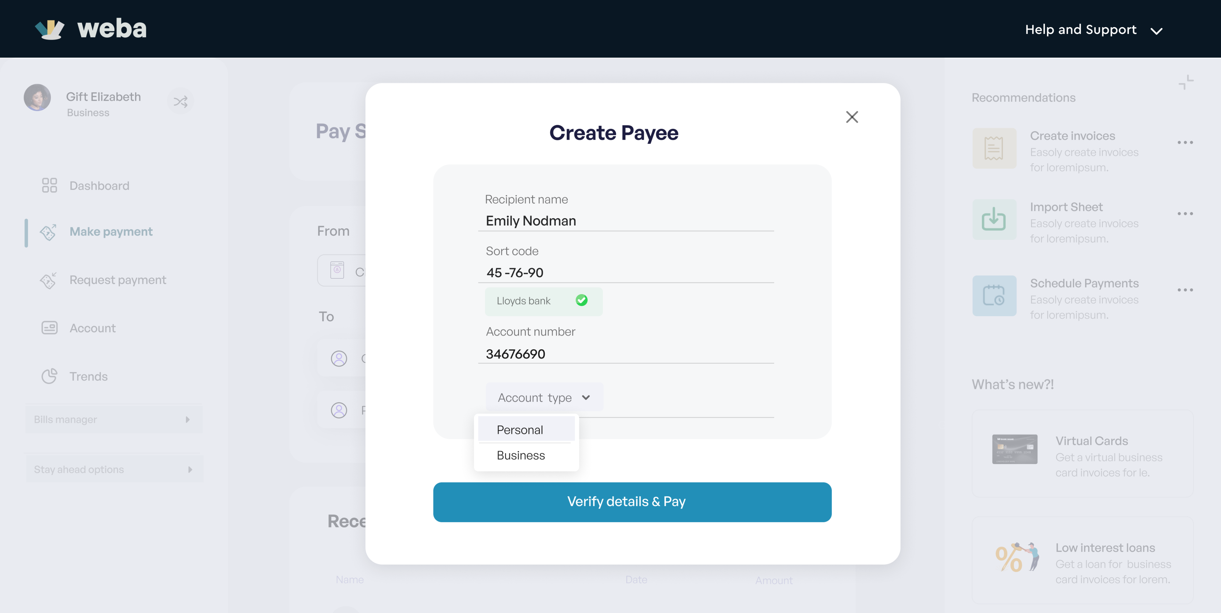
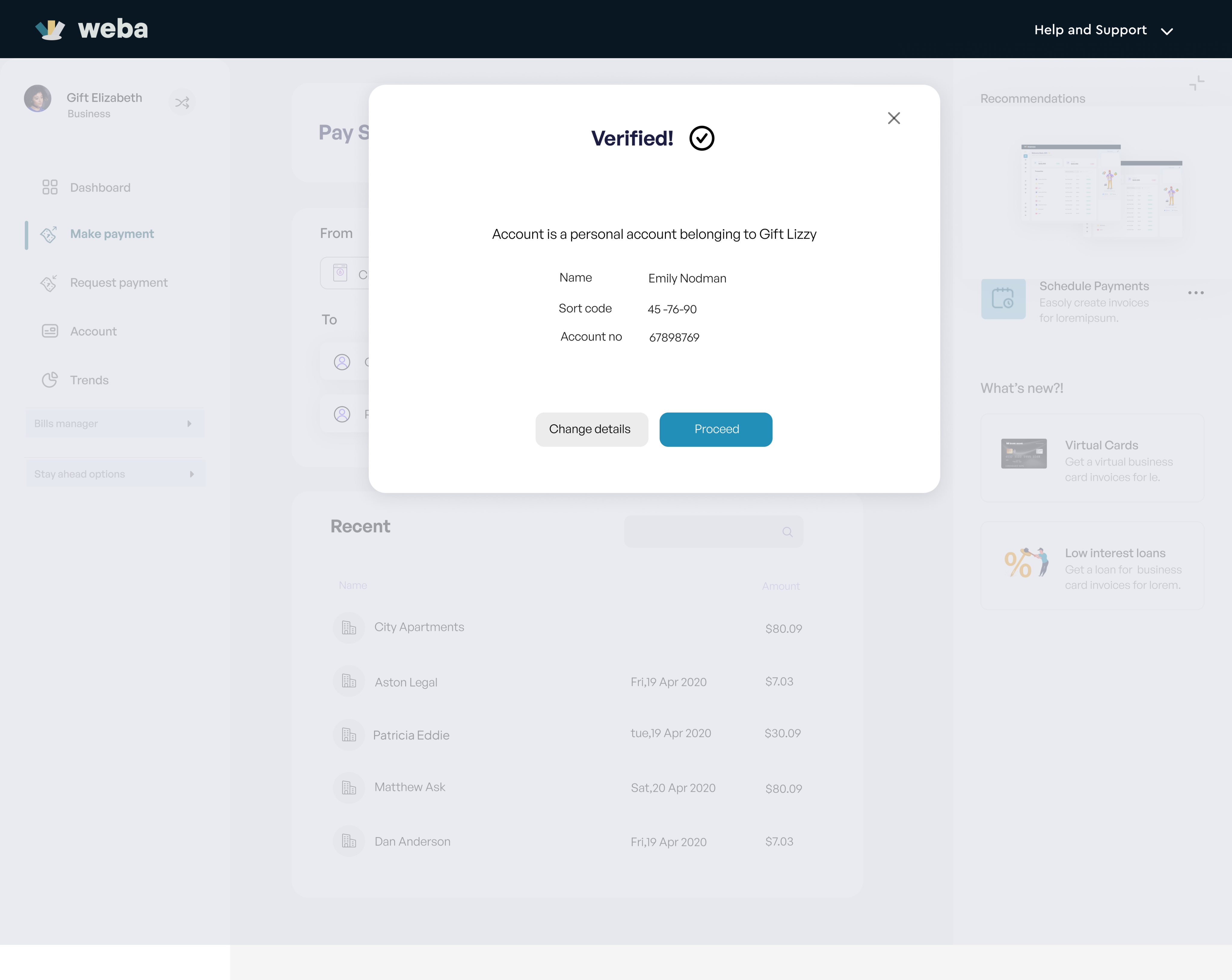
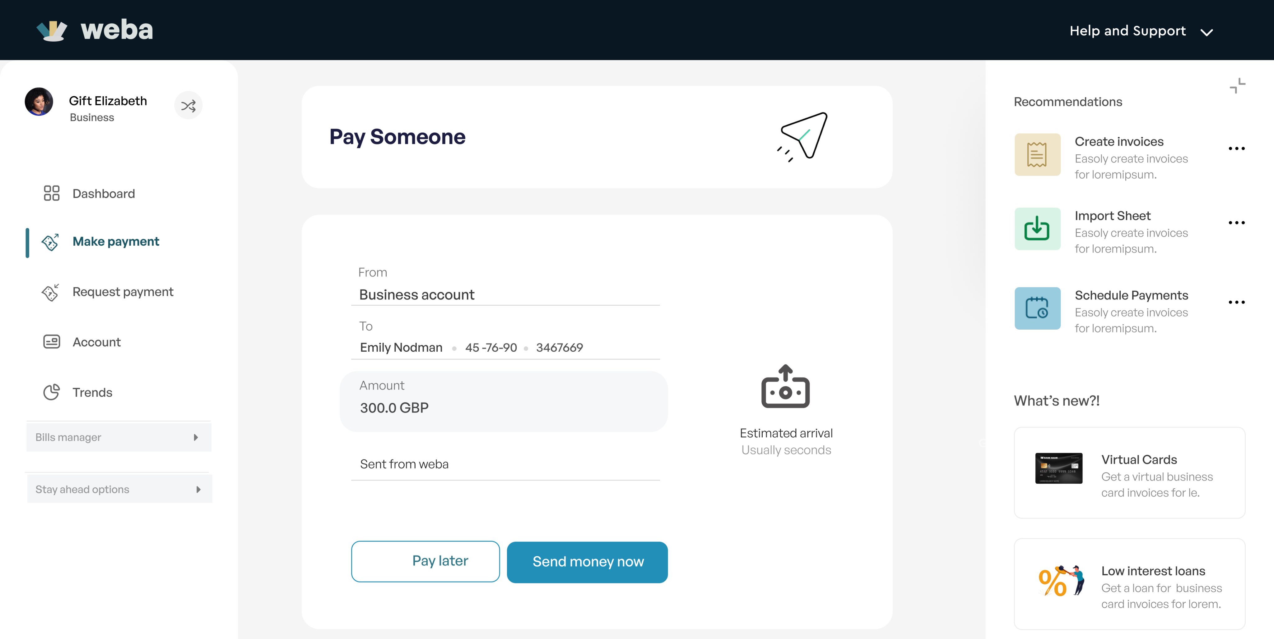
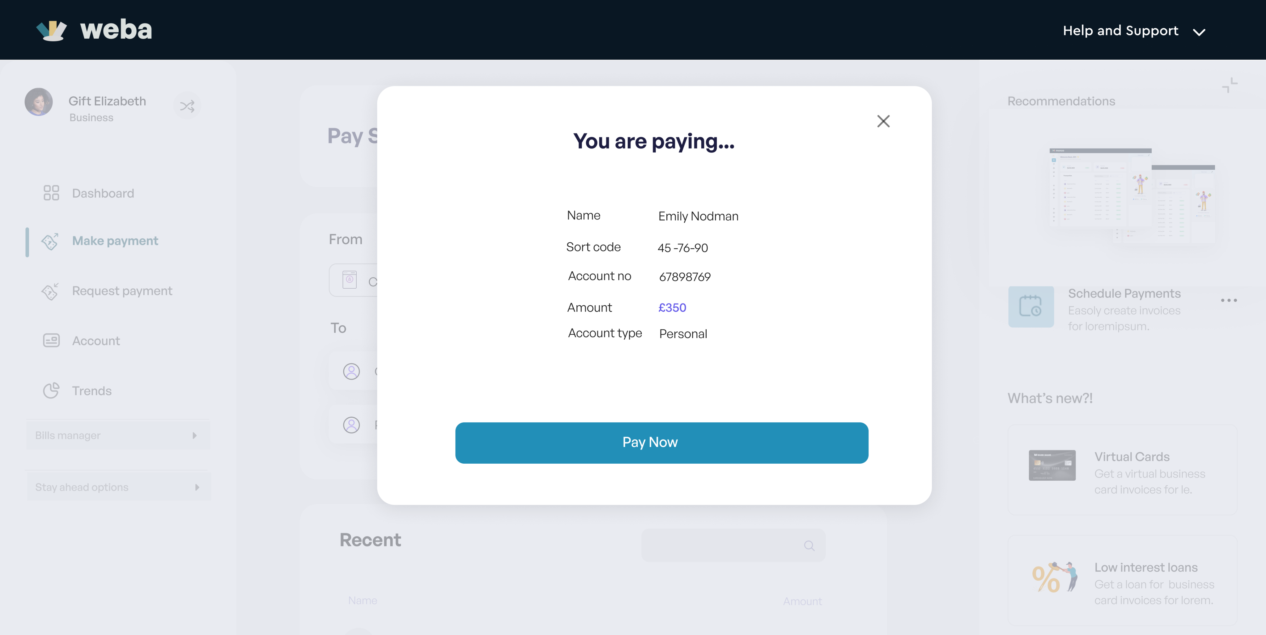
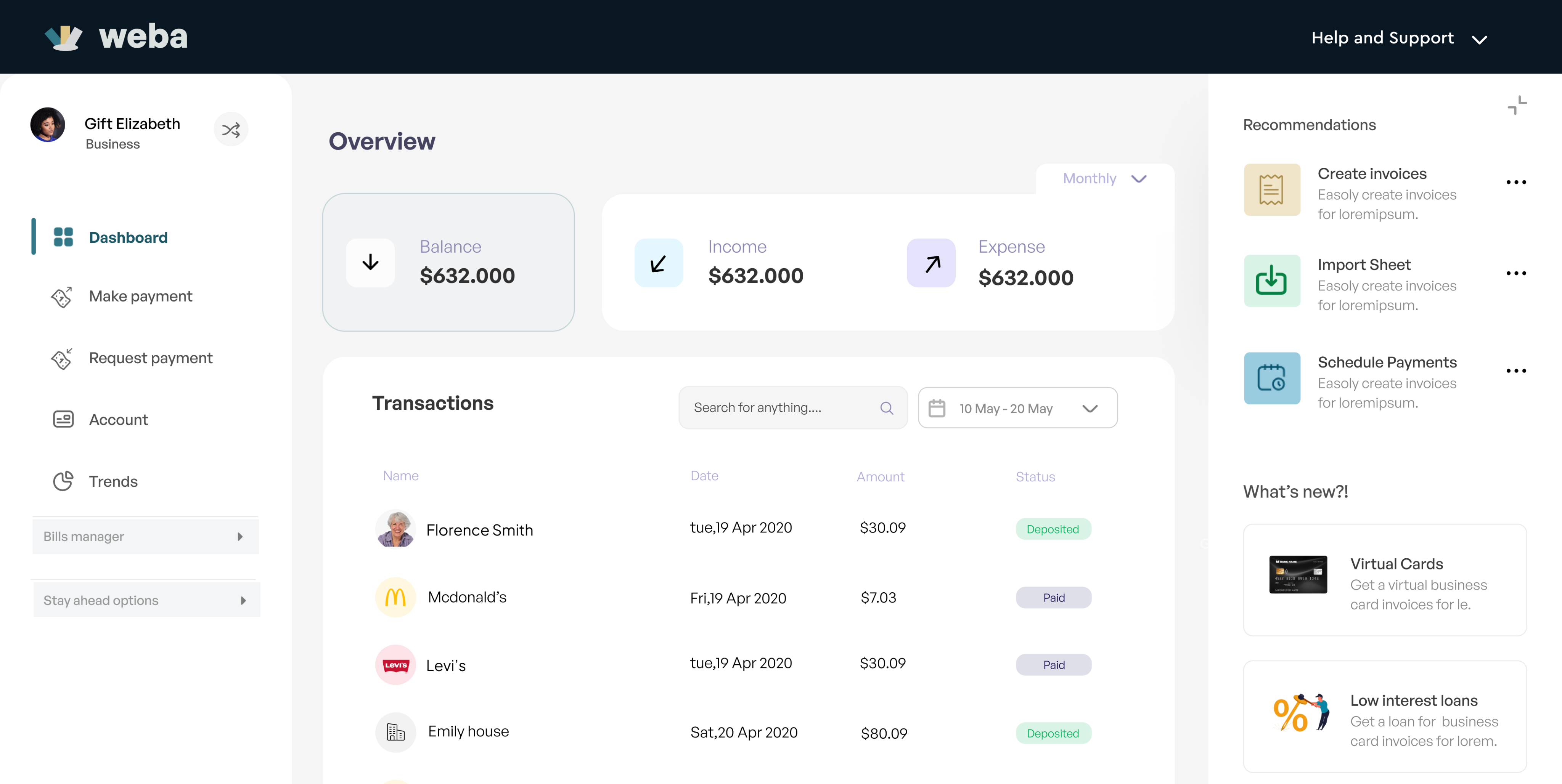
Making Payments with Weba
Every screen needed to create a seamless flow of interaction was designed, no matter how small the change was, this was done to ensure every element of the application was in tune. We do not want a loading button having a different color from the project's accent color. Leaving out bits and pieces for the developers to fill in may result to inconsistency in the design.
Since Weba business is available to its mobile users to subscribe, security was linked to their mobile apps. Users have to confirm login though email and their mobile apps. A code login system is to be introduced in later versions of Weba for web.
Exploring pop-ups
Get paid, Invoicing, Receipts.
Every screen needed to create a seamless flow of interaction was designed, no matter how small the change was, this was done to ensure every element of the application was in tune. We do not want a loading button having a different color from the project's accent color. Leaving out bits and pieces for the developers to fill in may result to inconsistency in the design.
Since Weba business is available to its mobile users to subscribe, security was linked to their mobile apps. Users have to confirm login though email and their mobile apps. A code login system is to be introduced in later versions of Weba for web.
Exploring pop-ups
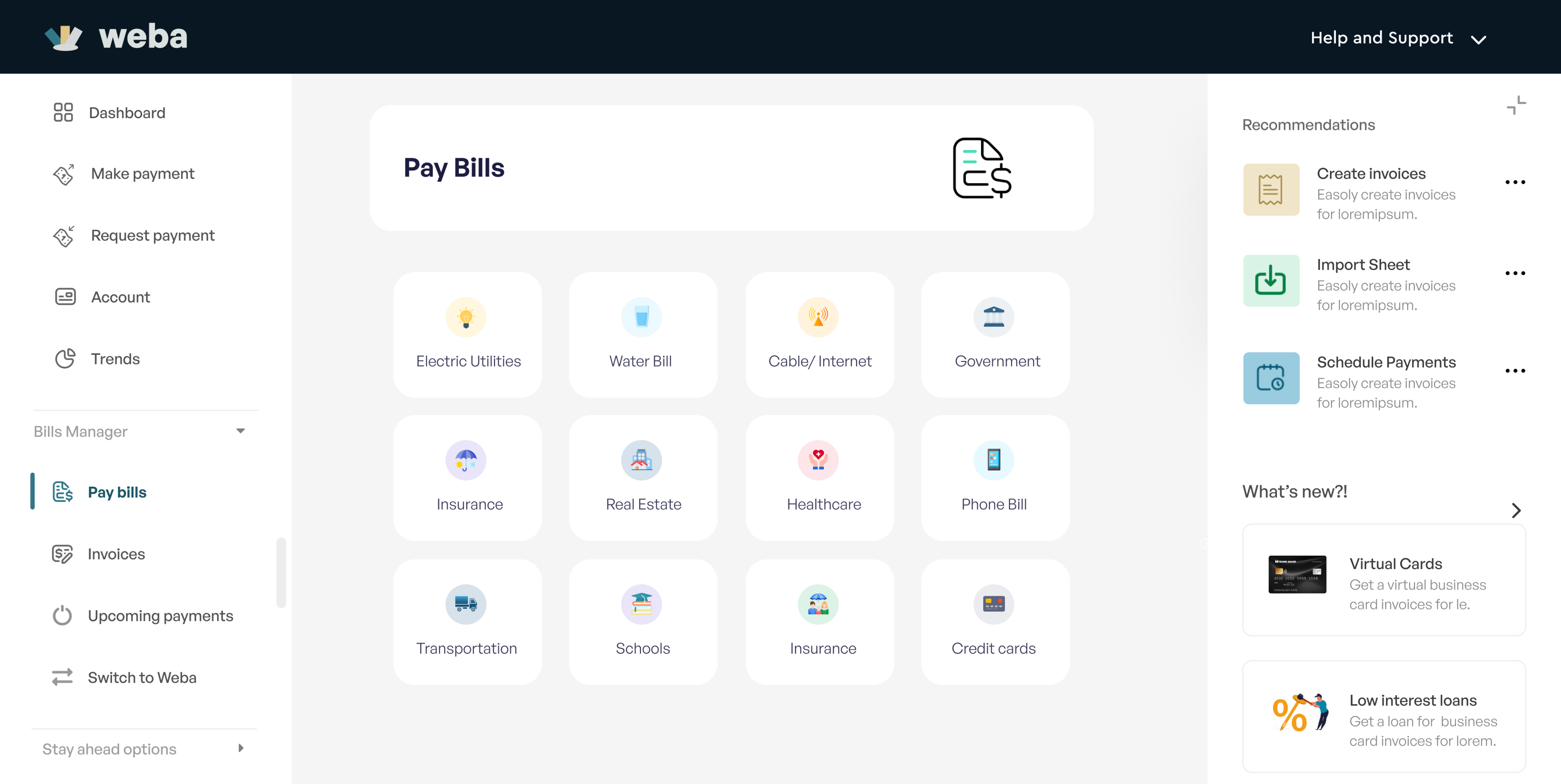
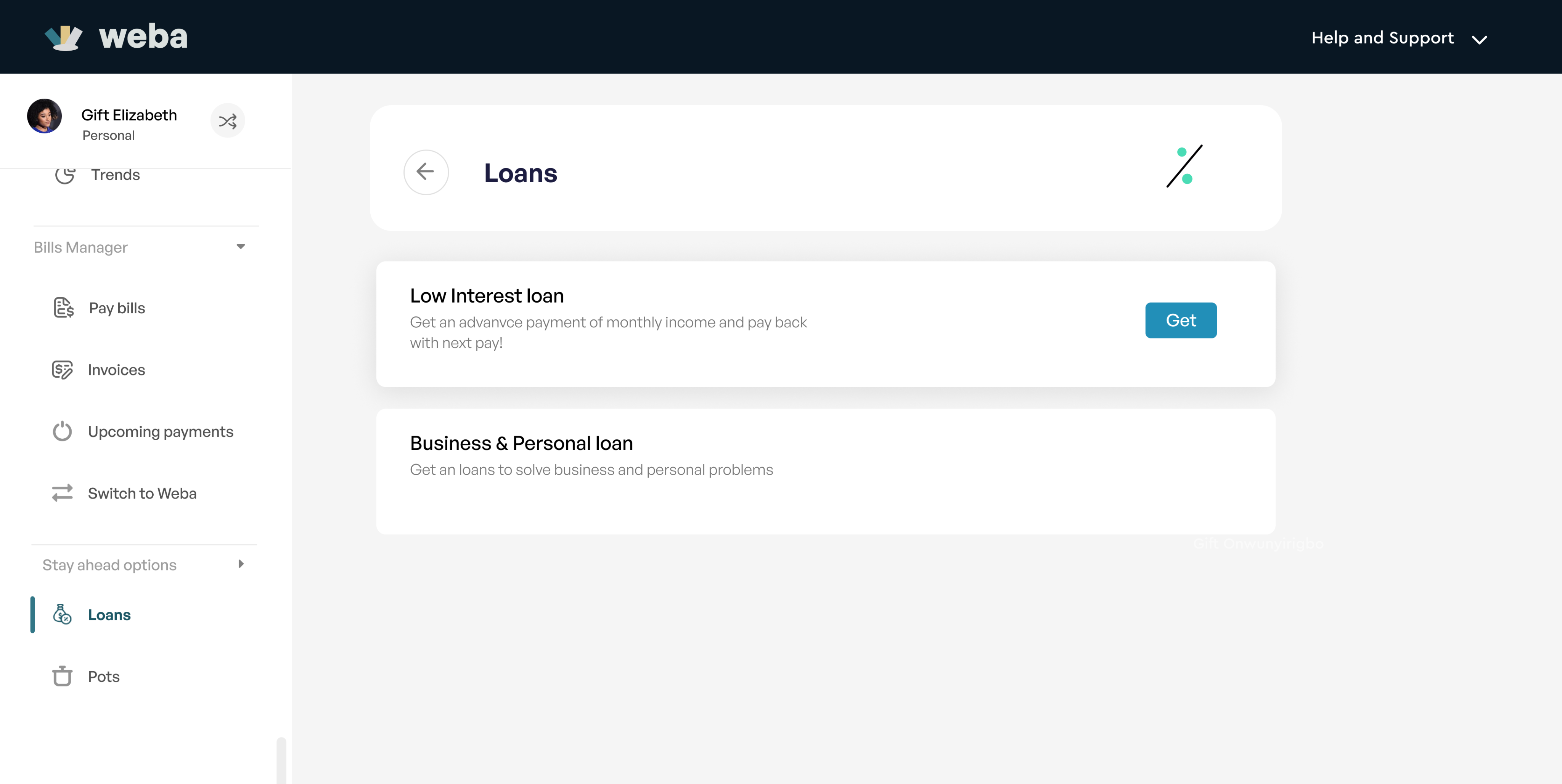
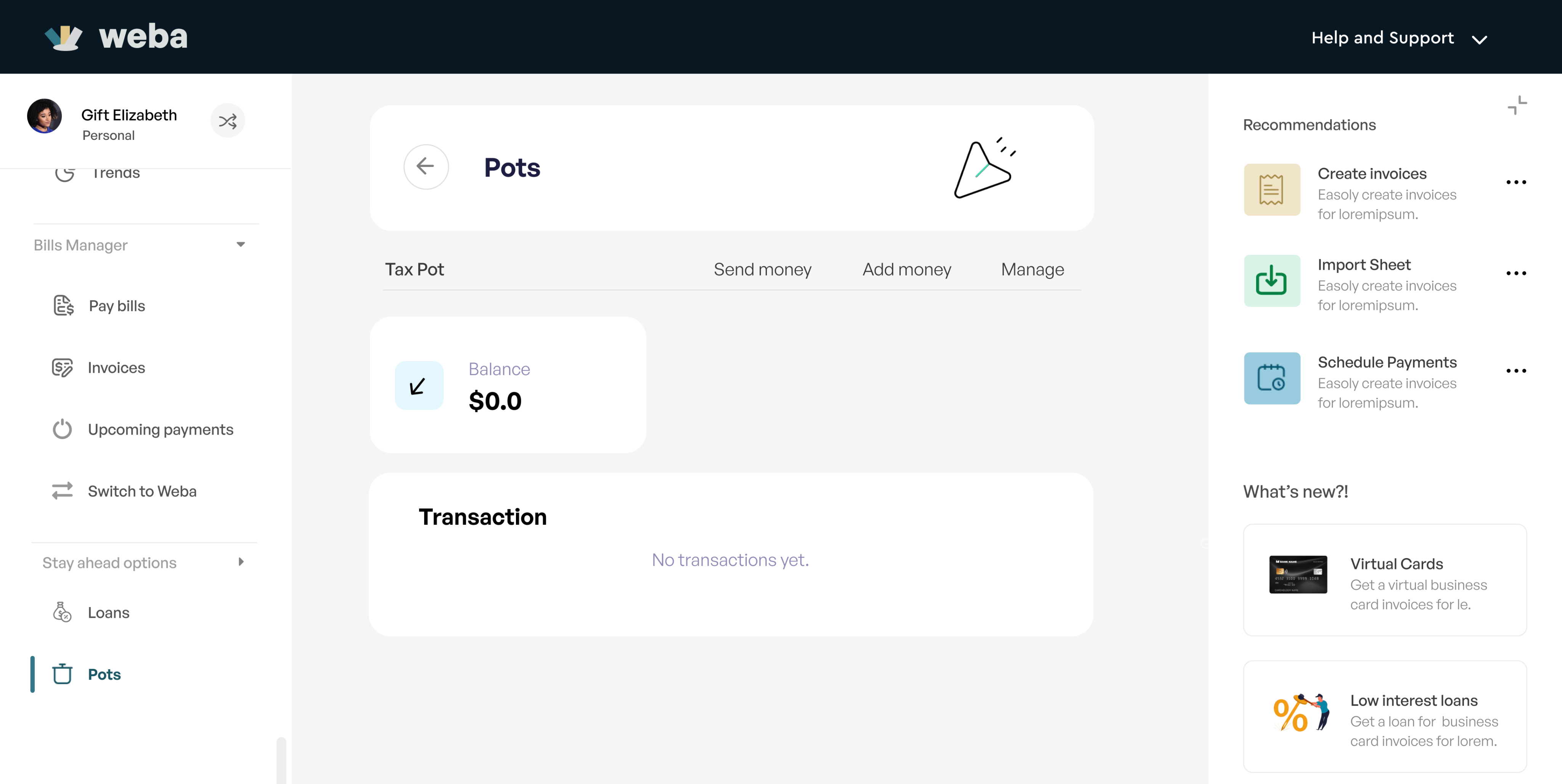
Bill payments, loans, savings.
Every screen needed to create a seamless flow of interaction was designed, no matter how small the change was, this was done to ensure every element of the application was in tune. We do not want a loading button having a different color from the project's accent color. Leaving out bits and pieces for the developers to fill in may result to inconsistency in the design.
Since Weba business is available to its mobile users to subscribe, security was linked to their mobile apps. Users have to confirm login though email and their mobile apps. A code login system is to be introduced in later versions of Weba for web.
Usability
Heuristics Evaluation
We conducted a heuristics evaluation to ascertain the usability of this application. we involved four experts, Chidi, Iyke, Reiner and Diana. These are all expert evaluators and they were asked to carry out specific tasks. Each evaluator was required to carryout the following, step by step
Step 1 : Jot down usability problems encountered on each Task on the task form using Nielsen's Usability Heuristics.
Step 2 : Rate these Usability problems Using Nielsen severity ratings.
Step 3 : Fill Heuristics data capture form
Final step was my job to do, I had to merge these results and make informed decisions that will serve as a constructive feedback to make changes to the design. See images below for some of the design improvements.
See Chidi's Evaluation Report
Communication and collaboration.
Design Handoff
At every milestone of these project, I communicated effectively with the developers and Product manager.
So, when it came to the point of handing off the design to the developers, they already knew what to expect. It was the MVP, majorly priority features have been designed at this time.
I put in place Interactions or notes on the artboard to serve as a guideline to what is epected at each scenerio I felt may be misunderstood. Handoff was smooth but as usual I still had a few questions coming in from the developers from time to time.
My next line of action was to follow through with design and ensure what was being developed is in line with the approved product design.
Incomprehensive Product Requirement Document (PRD)
One major challenge encountered was the scantiness of the PRD, it was more like an idea jot down. Projects purpose and features were stated but functionalities and behaviors were not included. Leaving me with the job of figuring out a lot of things
A comprehensive PRD helps in interpreting the clients objective and goal of the project better. It also poses as a guide to the designer when designing. For aesthetics sake, a designer may be inclined to add unnecessary elements or features, but with a comprehensive PRD, the designer is obligated to stick to the requirements.
The other challenge would be having to work solo on this project on a thin timeline.
Nothing good comes easy.
Key Learnings
I learnt a lot while working on his project but what stood out for me, was the importance of proper research and planning. Understanding your objective from the get go and doing things in an orderly manner will greatly improve work output and even reduce turnaround time!